You are browsing the archive for January2012
Project 1 | Step B
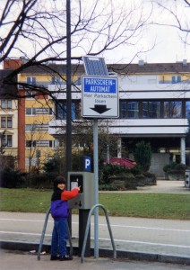
When I was seven years old, my family went on vacation to Germany. Before we left, my parents bought my sister and I each a disposable camera, telling us we could take pictures of anything we wanted. This was a new power to us; we had the opportunity to create our own memories, to choose what gets preserved and what becomes forgotten. But we had to be frugal; we would be in Germany for two weeks and could only choose 24 moments to preserve. We snapped away, filling our film rolls and returned home with full cameras. After turning in the camera for development and receive the finished product, we were expectant and excited to see how our photography skills fared. My sister had taken plenty of photos of other members of our family, some of the large German castles we visited, a few restaurants we visited and the food we ate, various traditional vacation photos. I had 24 pictures of German road signs. I wasn’t aware of design’s omnipresence until I was in a foreign country where, while the road signs served the same function, they were visually different.
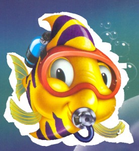
The next memory I have of design is being in middle school and I was helping someone create a graphic of a fish by taking a photo of a fish and removing the background. I was working in MS Paint and going pixel by pixel, separating the fish from the background. I should say that I enjoy teaching myself new software, but I only ever seem to learn by necessity. Three hours in and I realized that my doing-design-with-MS-Paint plan was flawed and I needed to learn Photoshop. Similarly, a year or so later, I wanted to create an animation for a website, so I created each individual frame and compiled them into a GIF, which had worked several times for me before. This animation was more ambitious and the resulting GIF was about 8 MB. I realized this was ridiculous and decided it was time to start playing around with Flash. This was back when it was called Macromedia Flash.
Despite an affection and interest for design most of my life, after high school I went to University of Michigan and majored in mathematics and computer programming. I had had classes in these subjects in middle school and high school, and enjoyed (and enjoy) them. In my unique sense of stupidity, I hadn’t realized that people could actually make a living as graphic designers, or it just never really clicked as a possibility for me. Two years into a Math degree and I realize that, while I am enjoying my classes, I won’t enjoy a lifetime of the potential jobs for me: teaching math or being an accountant. (This is an exaggeration, I know.) I left, and find myself here at the College for Creative Studies.
5 to 10 things that inspire me (in no particular order)
- Books by Mike Perry
- Typefaces by H&FJ
- Showers (Amazing for getting thoughts done)
- British Television
- The album “Solo Piano” by Gonzales
- Sleep (I have some strange dreams sometimes where people I know tell me ideas in the dream, ideas characteristic of their thought process not mine. If I use the idea, I always have a strange feeling of plagiarism, despite the fact that I know the idea came from in my mind. Somewhere.)
5 top websites
I use Google Reader to aggregate any website I would regularly visit, so I mostly only visit two websites: google.com/mail and google.com/reader. With that said, these are some of the feed I look forward to seeing the little bold number of unread posts next to:
designenvy.aiga.org
branding10000lakes.com
artofthetitle.com
typetoken.net
idsgn.org/posts
design-milk.com
xkcd.com
theoatmeal.com
whatkatieate.blogspot.com
and some photos, to round it out:
Me in front of a German parking sign, age 7
I randomly took this photo for material for some kind of collage project, but I quite like it on its own.
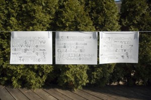
Typeface sketches! Turns out it’s not that hard to turn scans into fonts. Just tedious.
The aforementioned fish. You can see the point where I gave up and got Photoshop.
Project 1 | Step A
1. The New York Times header, the most important information on the webs tie, identifying the website.
2. In a sea of text, a relatively large image stands out. The photo for the top story grabs your eye and is visually and hierarchically second.
3. The main navigation, at the top of the page. I originally had this as number 2, but due to its small text size and simple styling, the large photo seems more important.
4. The search bar is not a visually hierarchically high, but as many users who visit the site are looking for something specific, the search bar’s placement brings it higher on this list.
5. The rest of the site seems a sea of text, but within this sea, the right sidebar is next important because of its width and therefore legibility.
6 & 7. While the rest of the site seem to blend into the background, these two sections are a bit above them, solely for their small colorful images.
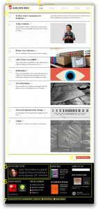
1. Again, the website title is number one. People want to know what website they’re on, and based on Western reading habits, it is read first.
2. Here the menu gets a higher placement because it is larger, stylized and right next to the website title.
3. The blog or updates section, the largest section and likely what you came to the website for (unless you chosen the appropriate page from the menu already.)
4. The “More Articles” button just comes next. Maybe because of its size it could go lower on this hierarchy list.
5. Rather than treating the entire footer as one element, I considered the “About Me” section higher hierarchically because of its top left placement, and importance of information.
6. The rest of the footer seems all about on the same par, hierarchically. (How do you pronounce “hierarchically?”)
7. The footer’s footer. Small, out of the way, not used by the average user. Thus, last on the list.

