Randall Bruder & Intro to Web

Posts filed under "Uncategorized"

In Class Exercise: Navigation

April 9, 2012

1. How do you know which items are clickable? Is it color? Placement? Does something change on the hover?

I am conditioned as a web user in a traditional website to find the “menu area,” this will contain the links I need to navigate through my site. I expect to find it at the top of a page, and unsurprisingly, Lab Partners and Trent Walton’s portfolio site do not disappoint.

Screen-Shot-2012-04-09-at-6.44.13-PM Screen-Shot-2012-04-09-at-6.44.21-PM

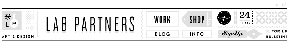
What’s more, I would expect the name of the site or the logomark for the site, typically found in the top left corner, to return me back to the ‘landing’ page for the site. Both site behave as expected.

As it stands, I have a pretty good idea how to navigate either site, but to reinforce what is clickable and what isn’t, both sites have hover states for their links, both introducing color into the page.

Screen-Shot-2012-04-09-at-7.03.17-PM    Screen-Shot-2012-04-09-at-7.03.29-PM    Screen-Shot-2012-04-09-at-7.03.42-PM    Screen-Shot-2012-04-09-at-7.03.45-PM

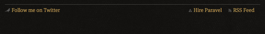
Also note: both menus are delineated by lines. In both site too, the footers are also ‘blocked-off’ from the content of the page with lines:

Screen-Shot-2012-04-09-at-7.12.22-PM Screen-Shot-2012-04-09-at-7.13.45-PM

2. How does the navigation in each site relate to the story or concept being portrayed?

The design of the Lab Partner’s menu reflects the design of the site, very 60’s pop art feel. Likewise, Trent Walton’s menu design mirrors the clean and uncluttered text-based nature of the rest of the site.

The functional design of each site doesn’t play too much into the overall concepts of each site, other than the fact that each is simple and clean, relating to the clean and simple site designs. Other sites, like the Annenberg Community Beach House site where the navigation feels intrusive or unintuitive, much like the rest of the site.

3. What role does user play in the reveal of information/content?

The interaction of the role over in both sites adds color to the menu system in both cases, but not further content is revealed. Both menus would function just as well (but not as well aesthetically) without the interactivity.

4. Are you able to tell where you are within the site? How you got there? How to go back? Where to go next? What visual indicators provide you with that information?

No. Well, yes. Sort of.

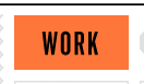
Take a look at Lab Partner’s shop page:

Screen-Shot-2012-04-09-at-9.22.53-PM

I know I’m on the shop page because I just clicked the “Shop” button in the menu. Maybe someone emailed me a link directly to this page, I know I’m on the shop page because the URL is shop.lp-sf.com. And without seeing the URL, I know I’m on a shop page because the images have prices near them, the sidebar makes reference to a “basket” and uses terms like “checkout” and the design incorporates elements like the awning and the brick pattern to the left.

But nothing specific in the navigation really tells me I’m on the shop page. (But it doesn’t need to.)

Both navigation systems on both sites function this way; with no reinforcement telling you what page you’re on.

Project 3 | Step F

April 2, 2012

Project 3 | Steps D & E

March 26, 2012

map

wireframe1

wireframe2

wireframe3

In-Class CSS Button

February 22, 2012

button1button2 

(Normal and pressed states)


Code:

code

View the button here.


Also, here’s a slick metaphor about webfonts.

Typefaces are the tools a designer uses, the same way a builder uses tools to create a house; Verdana is a hammer, Helvetica is a table saw, Gotham, a tower crane. In the same way an construction team can build a better structure with better equipment, a designer can design better with well crafted typefaces. So asking a designer to create a webpage with only 7 basic fonts is like asking someone to build you a house using only a hammer.

So asking the importance of webfonts is about on par with asking a foremen the importance of a tower crane when building a skyscraper.

(On a side-note: it does seem the ability to use webfonts is like a Home Depot opening for the first time, there are all these new amazing powerful complicated tools available to use, but everyone runs for the free screwdrivers in the checkout lane. And ‘screwdrivers’ is a metaphor for the typeface “Museo.” But free is free.)

Project 2 | Step F

February 20, 2012

A comp for the homepage / live feed page:

  mock-1

The grid the site is built on:

mock-2

A lightbox that would appear to first time visitors:

mock-3

(Also, try opening this lightbox comp and the live feed comp in two tabs, side by side and switch back and forth between them.)

Noah Stokes & CSS Positioning 101

February 15, 2012

alistapart.com/articles/css-positioning-101

The article is pretty straight-foward, the only thing that surprised me was that you could set the size of a div by specifying all four positioning elements (top, bottom, left, and right). So, instead of a paragraph, I thought I’d try to represent the four properties with two fish:

(FYI: In the HTML, if it were to exist, the “fish2” div is a child of “fish1.”)

css-fish3

In Class-Exercise on “Position” Property

February 13, 2012

Steps 1-5 or steps 2-6 or whatever.

Project 2 | Steps D & E

site_map

ss1

In this mock-up, the red represents “position: absolute;” content, while the blue area is free to scroll.

ss2

This way, the menu and text-area box for sharing are always visible. In this example below, notice the “live feed” area is scrolled down, and is starting to disappear behind the sharing box.

ss3

Here, an about page is based on the same structure as the main page. It’s a pretty boring looking page.

ss4

In-class Exercise on Divs

February 9, 2012

Sytlin’:

Screen-Shot-2012-02-08-at-9.21.32-PM 

And it looks like:

Screen-Shot-2012-02-08-at-9.22.29-PM

Project 2 | Step B (Update)

concept_statement_21