Randall Bruder & Intro to Web

You are browsing the archive for February2012

In-Class CSS Button

February 22, 2012

button1button2 

(Normal and pressed states)


Code:

code

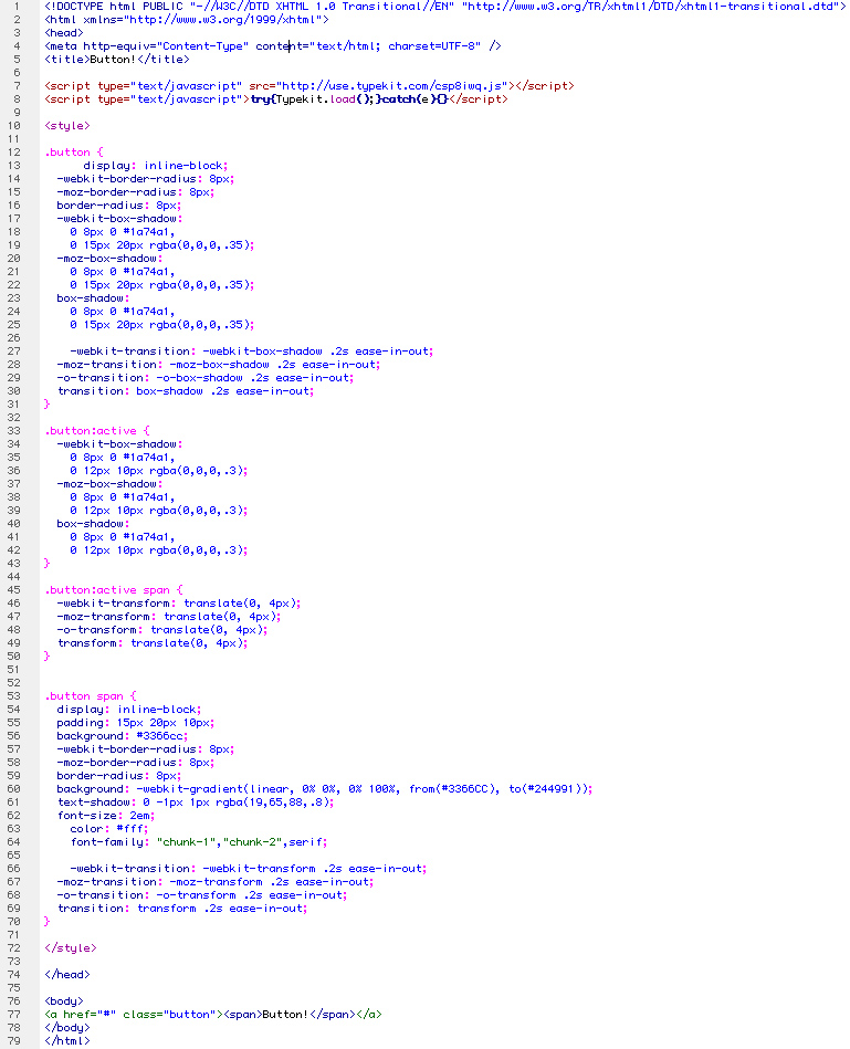
View the button here.


Also, here’s a slick metaphor about webfonts.

Typefaces are the tools a designer uses, the same way a builder uses tools to create a house; Verdana is a hammer, Helvetica is a table saw, Gotham, a tower crane. In the same way an construction team can build a better structure with better equipment, a designer can design better with well crafted typefaces. So asking a designer to create a webpage with only 7 basic fonts is like asking someone to build you a house using only a hammer.

So asking the importance of webfonts is about on par with asking a foremen the importance of a tower crane when building a skyscraper.

(On a side-note: it does seem the ability to use webfonts is like a Home Depot opening for the first time, there are all these new amazing powerful complicated tools available to use, but everyone runs for the free screwdrivers in the checkout lane. And ‘screwdrivers’ is a metaphor for the typeface “Museo.” But free is free.)

Project 2 | Step F

February 20, 2012

A comp for the homepage / live feed page:

  mock-1

The grid the site is built on:

mock-2

A lightbox that would appear to first time visitors:

mock-3

(Also, try opening this lightbox comp and the live feed comp in two tabs, side by side and switch back and forth between them.)

Noah Stokes & CSS Positioning 101

February 15, 2012

alistapart.com/articles/css-positioning-101

The article is pretty straight-foward, the only thing that surprised me was that you could set the size of a div by specifying all four positioning elements (top, bottom, left, and right). So, instead of a paragraph, I thought I’d try to represent the four properties with two fish:

(FYI: In the HTML, if it were to exist, the “fish2” div is a child of “fish1.”)

css-fish3

In Class-Exercise on “Position” Property

February 13, 2012

Steps 1-5 or steps 2-6 or whatever.

Project 2 | Steps D & E

site_map

ss1

In this mock-up, the red represents “position: absolute;” content, while the blue area is free to scroll.

ss2

This way, the menu and text-area box for sharing are always visible. In this example below, notice the “live feed” area is scrolled down, and is starting to disappear behind the sharing box.

ss3

Here, an about page is based on the same structure as the main page. It’s a pretty boring looking page.

ss4

In-class Exercise on Divs

February 9, 2012

Sytlin’:

Screen-Shot-2012-02-08-at-9.21.32-PM 

And it looks like:

Screen-Shot-2012-02-08-at-9.22.29-PM

Project 2 | Step B (Update)

concept_statement_21

Project 2 | Step B & C

February 6, 2012

Concept statment:

concept_statement

Some drawings and photographs:

Project 2 | Step A

research1

Complete with AA chips too.

research2

research3

Some annotated books, too.